Styling plots in base R graphics to match ggplot2 classic theme
| Updated:

Hi! I'm Ryan Moore, PhD bioinformatics data scientist, functional programming fan, and sports nerd. Contact me on LinkedIn!
ggplot2 is an R package for creating graphics in a declarative way and is based on The Grammar of Graphics. If you have never used ggplot2, it’s a nice library for making publication ready figures with much less hassle than the base R graphics.
Something I think is pretty fun is to try and recreate ggplot2 style figures using base R graphics. Sometimes, I look at the actual plotting code in the ggplot2 package, but I think it is more fun to just make a figure with ggplot and then try and get a reasonable match with base R. Doing so, you really get an appreciation of the convencience of the ggplot2 package.
With that, let’s try and recreate a figure using the “classic” ggplot2 theme: theme_classic.
If you want to learn more about base R graphics, check out my deep dive into rotating axis labels in base R plots.
Set up
First, here is some “set up” code where we create some data and set some variables to hold colors and stuff like that.
library(ggplot2)

k_purple <- "#875692"
k_orange <- "#F38400"

set.seed(12341234)

x <- 1:100
y <- (rnorm(100, sd = 15) + x + 100) / 10
group <- c(rep("A", 50), rep("B", 50))
With that out of the way, let’s see the ggplot2 classic theme that we will try and match. Here it is:
ggplot(data = data.frame(x, y, group),
       mapping = aes(x = x, y = y, color = group)) +
    geom_point(size = 2) +
    scale_color_manual(values = c(k_purple, k_orange)) +
    theme_classic()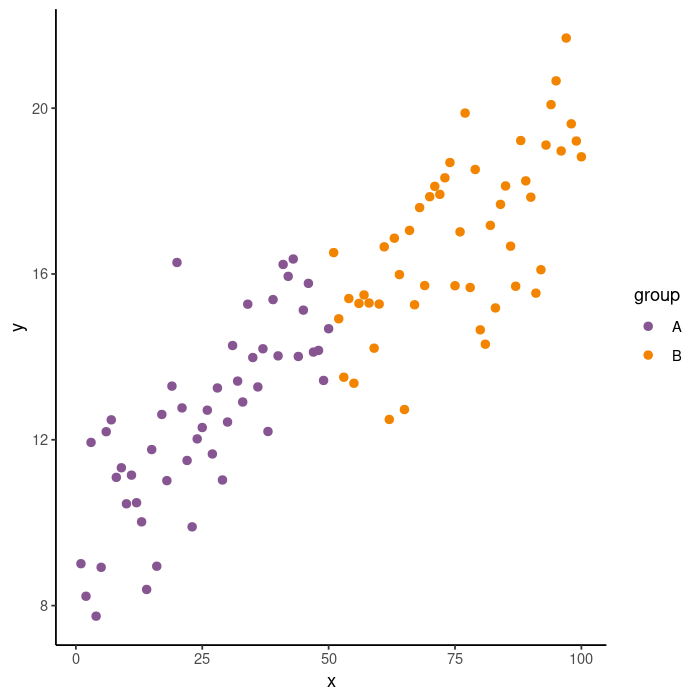
And finally, let’s compare the simplest possible base R graphics plot. I’m sure that you’re familiar with what it looks like!
plot(x, y)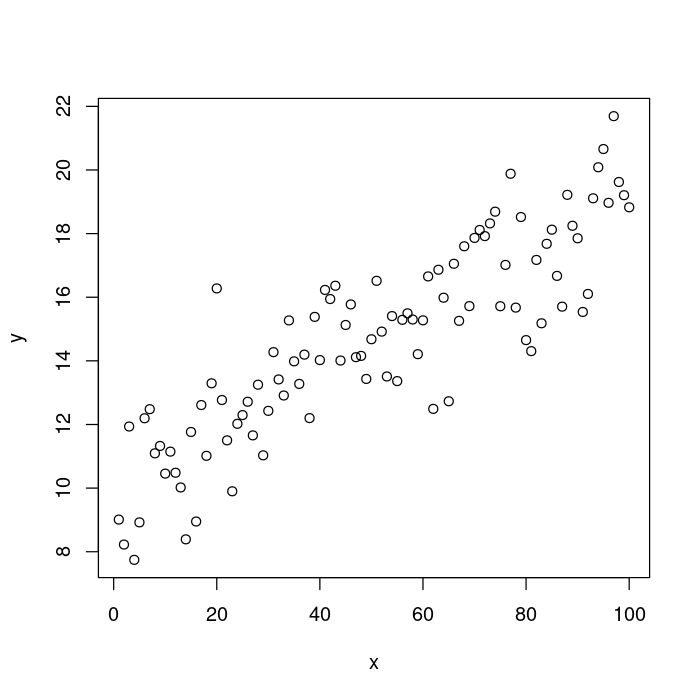
You can see that that plot is pretty far from where we want to be. Let’s go step-by-step getting closer to the theme_classic ggplot version each time.
Fixing the axes
The first thing you see is that box around the plot that isn’t present in the ggplot version. Let’s remove it by passing bty = "n" to the plot function.
plot(x, y,
     ## Remove the box around the plot.
     bty = "n")
You can see that the axes are a bit different than in the ggplot2 version. Here, the final ticks are the edges of the axis. The ggplot version has a nice, solid line for the x and y axes that connects at the bottom left corner. You can get that effect with the bty option to plot.
The bty parameter is an interesting one. Here is the section from the par help file describing bty:
‘bty’ A character string which determined the type of box which is drawn about plots. If ‘bty’ is one of ‘”o”’ (the default), ‘”l”’, ‘”7”’, ‘”c”’, ‘”u”’, or ‘”]”’ the resulting box resembles the corresponding upper case letter. A value of ‘”n”’ suppresses the box.
Those options look pretty weird, but they each show the “shape” of what the box will look like: l will look like a upper case L, or have a line on the left and the right only. The 7 will look sort of like a 7, or have the box lines on the top and right only. Since we want lines on the left and bottom, we can use bty = "l". I will also remove the default x and y axes (using xaxt and yaxt) since we don’t want it to overlap the lines of the box. Also we can increase the width a bit with lwd.
While you can control the box inside the plot function, I will use the box function instead. That way, it will be a little easier to customize. To do that, we will keep the bty = "n" in the plot function to turn the box off, then add it back in after with box.
plot(x, y,
     ## Remove box.
     bty = "n",
     ## Remove default x and y axis.
     xaxt = "n", yaxt = "n")
box("plot",
    ## Add 'box' lines to the bottom and left of the plot.
    bty = "l",
    ## Increase width of box lines.
    lwd = 2)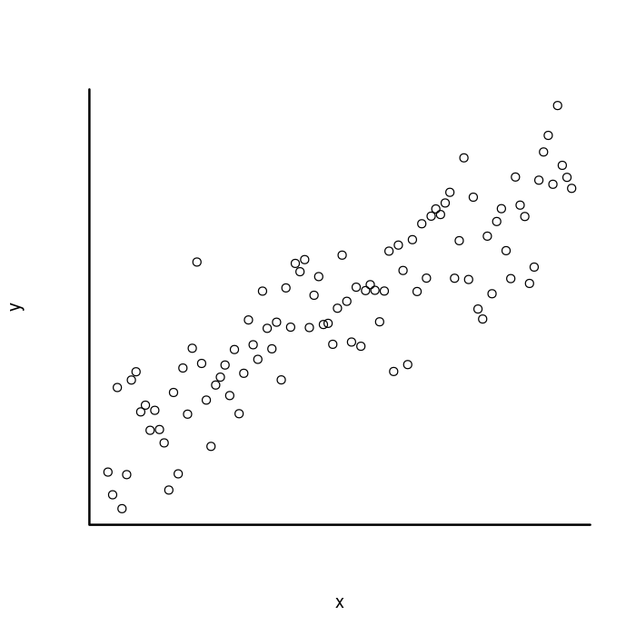
Add the tick marks
Now let’s add the axis ticks and labels back in. For that we use the
axis function. We will change a few of the options at once, so I
will go over them first. The side parameter controls where the axis
is drawn with respect to the plot: 1 = below, 2 = to the left, 3 =
above, and 4 = to the right. Remember how the axis is drawn with the
line by default? We turn that off with lwd = 0 and then we set the
tick width to match the box width using lwd.ticks = 2. Finally, we
want to rotate the tick labels of the y
axis
so they are perpendicular to the axis. Here it is.
plot(x, y, bty = "n", xaxt = "n", yaxt = "n")
box("plot", bty = "l", lwd = 2)
## X Axis
axis(side = 1,
     ## Don't draw the axis line.
     lwd = 0,
     ##  Match the width of the tick marks to the box lines.
     lwd.ticks = 2)
## Y axis
axis(side = 2, lwd = 0, lwd.ticks = 2,
     ## Rotate tick labels prependicular to the axis.
     las = 2)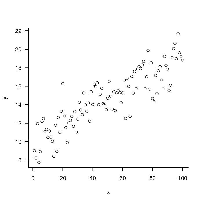
Adjusting ticks and tick labels
Next, we are going to make some adjustments to the length of the tick marks and to where the axis labels are drawn. This can get a little weird, and there are multiple ways to do it. Let’s go through some of the options we will need.
The mgp parameter is a little
tricky.
It is a three part vector that controls the margin for the axis title
(mgp[1]), axis (tick) labels (mgp[2]), and the axis line
(mgp[3]). The default value is c(3, 1, 0). The units are in
lines of text.
We want to move the axis labels and tick labels closer to the axis, so we need to reduce the first two numbers in that vector. This time, I’m going to use the par function to set the parameter since I want it to apply to all the plotting functions.
## Move the axis label and tick labels closer to the axis line.
par(mgp = c(1.5, 0.4, 0))
plot(x, y, bty = "n", xaxt = "n", yaxt = "n")
box("plot", bty = "l", lwd = 2)
axis(side = 1, lwd = 0, lwd.ticks = 2)
axis(side = 2, lwd = 0, lwd.ticks = 2, las = 2)
Adjusting tick label length
Now that we’ve tweaked the label positions, we need to adjust the
tick length. We do that with tcl parameter to the par function,
which specifies tick mark length as a fraction of the height of a line
of text. So tcl = 1 will make tick labels the same height as a line
of text, tcl = -0.5 (the default) will make them 1/2 the line
height. The sign of the argument controls the direction the ticks
point: positive values point into the chart, negative values point
away. Let’s make them half as long as they are now with tcl =
-0.25.
par(mgp = c(1.5, 0.4, 0),
## Reduce the size of the tick marks.
tcl = -0.25)
plot(x, y, bty = "n", xaxt = "n", yaxt = "n")
box("plot", bty = "l", lwd = 2)
axis(side = 1, lwd = 0, lwd.ticks = 2)
axis(side = 2, lwd = 0, lwd.ticks = 2, las = 2)
Moving the x labels a bit more
That’s pretty good, but to my eye, the x axis tick labels are still a
bit too far away from the ticks. To fix that, we can pass the mgp
param directly to the axis function that we use to draw the axis.
It will overwrite the global value set by the par function, but only
for the function we pass it to. The 2nd element in the mgp vector
controls the axis tick labels, so we will reduce it from 0.4 to
0.2.
par(mgp = c(1.5, 0.4, 0),tcl = -0.25)
plot(x, y, bty = "n", xaxt = "n", yaxt = "n")
box("plot", bty = "l", lwd = 2)
axis(side = 1, lwd = 0, lwd.ticks = 2,
     ## Reducing the 2nd element from 0.4 to 0.2 moves the x axis
     ## tick labels closer to the axis line.
     mgp = c(1.5, 0.2, 0))
axis(side = 2, lwd = 0, lwd.ticks = 2, las = 2)
That’s better!
Fixing the points
Now that the axes are looking pretty good, let’s move on to the
points. To change the type of point that is plotted, you use the
pch parameter. I like pch = 20 for little dots, but pch = 16
could work as well. We can also change the size of the points with
the cex parameter. The default size is cex = 1 and increasing the
number will increase the size (e.g., cex = 2 will be twice as big).
We will use cex = 1.4 to approximate the size of the ggplot points.
Finally, to change the color, we will use the col parameter to the
plot function. For this parameter, we can pass in a vector the same
length as the x and y data vectors to specify the color for each
data point. The group vector we created at the beginning gives two
groups, A and B, for the points. We want to associate each group
with a color so we make a named color vector like this: colors <- c(A
= k_purple, B = k_orange). Then we use the groups vector to index
the colors vector like this: colors[group].
If that doesn’t make sense, here is a simple example.
tastiness <- c(Cookie = "yummy", Cake = "yucky")
desserts <- c("Cookie", "Cake", "Cookie")
tastiness[desserts]
## Cookie Cake Cookie
## "yummy" "yucky" "yummy"Let’s use that idea for our plot.
## Associate group A with purple and group B with orange.
par(mgp = c(1.5, 0.4, 0), tcl = -0.25)
colors <- c(A
= k_purple, B = k_orange)
plot(x, y, bty = "n", xaxt = "n", yaxt = "n",
## Draw filled in dots instead of open circles.
pch = 20,
## Increase the size of the dots.
cex = 1.4,
## Set the color of each dot based on its group.
col = colors[group])
box("plot", bty = "l", lwd = 2)
axis(side = 1, lwd = 0, lwd.ticks = 2, mgp = c(1.5, 0.2, 0))
axis(side = 2, lwd = 0, lwd.ticks = 2, las = 2)
Now that’s looking pretty good!
Adding a legend
It’s time now to put in the legend. We will start with something basic and then adjust it to match the legend in the ggplot2 figure.
To make a legend in base R graphics, use the
legend
function. We set the legend location with the x parameter. To put
the legend on the right side of the plot, we use x = "right". We
use the legend param to actually tell the legend the names of the
groups: legend = c("A", "B"). Now for the points, we specify the
style we used (pch = 20) and the different colors for the each group
(col = colors). Here it is.
par(mgp = c(1.5, 0.4, 0), tcl = -0.25)
colors <- c(A = k_purple, B = k_orange)
plot(x, y, bty = "n", xaxt = "n", yaxt = "n",
     pch = 20, cex = 1.4, col = colors[group])
box("plot", bty = "l", lwd = 2)
axis(side = 1, lwd = 0, lwd.ticks = 2, mgp = c(1.5, 0.2, 0))
axis(side = 2, lwd = 0, lwd.ticks = 2, las = 2)
## Add a legend to the right side of the plot.
legend(x = "right",
       ## Specify the group names.
       legend = c("A", "B"),
       ## And the colors of the dots.
       col = colors,
       ## And the shape of the dots.
       pch = 20)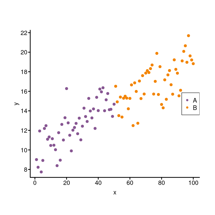
That’s not bad, but not quite the look we are going for. We need to add a legend title, remove the box around the legend, and tweak the size and spacing of the elements.
Adjusting the legend
To set the title, we can do this: title = "group". Removing the box
is done as in the main plot by setting bty = "n". I think it looks
nice when the size of the points in a legend to match the size of the
points in the plot. To do that, we can use the pt.cex option. We
set it to 1.4 to match the cex parameter that we passed in to
plot like so: pt.cex = 1.4.
It’s a subtle thing, but the spacing between the legend elements in
the ggplot figure are a bit more spaced out than in the base graphics
figure. To adjust that, we use x.intersp and y.intersp
parameters, which adjust the character spacing in the horizontal and
vertical directions (the units are line heights again). The default
is 1 for both. Since we want a little more space, we increase them
to something like this: x.intersp = 1.4, y.intersp = 1.15.
Here’s what those changes look like.
par(mgp = c(1.5, 0.4, 0), tcl = -0.25)
colors <- c(A = k_purple, B = k_orange)
plot(x, y, bty = "n", xaxt = "n", yaxt = "n",
     pch = 20, cex = 1.4, col = colors[group])
box("plot", bty = "l", lwd = 2)
axis(side = 1, lwd = 0, lwd.ticks = 2, mgp = c(1.5, 0.2, 0))
axis(side = 2, lwd = 0, lwd.ticks = 2, las = 2)
legend(x = "right", legend = c("A", "B"), col = colors, pch = 20,
       ## Add a title
       title = "group",
       ## Remove the box around the legend.
       bty = "n",
       ## Increase the size of the points to match those in the plot.
       pt.cex = 1.4,
       ## Increase the spacing in the x and y directions.
       x.intersp = 1.4, y.intersp = 1.15)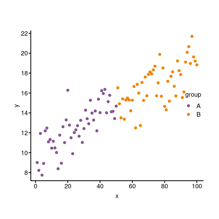
outside of the plotting area
Move the legend outside of the plotting area
Next we need to adjust the position of the whole legend. Do you see
how it is actually inside the plot on the base graphics version, but
outside of it in the ggplot version? We can move the legend around
with the inset parameter. The default value is 0. If you pass in
a positive number, the legend moves into the plot, whereas if you pass
in a negative number the legend moves out away from the plot. We will
pass in inset = -0.1 to bump it to the right to get it outside of
the plot.
par(mgp = c(1.5, 0.4, 0), tcl = -0.25)
colors <- c(A = k_purple, B = k_orange)
plot(x, y, bty = "n", xaxt = "n", yaxt = "n",
     pch = 20, cex = 1.4, col = colors[group])
box("plot", bty = "l", lwd = 2)
axis(side = 1, lwd = 0, lwd.ticks = 2, mgp = c(1.5, 0.2, 0))
axis(side = 2, lwd = 0, lwd.ticks = 2, las = 2)
legend(x = "right", legend = c("A", "B"), col = colors, pch = 20,
       title = "group", bty = "n", pt.cex = 1.4,
       x.intersp = 1.4, y.intersp = 1.15,
       ## Nudge the legend to the right.
       inset = -0.1)
Whoops! Do you see how the legend went right off the chart? To make
sure the legend doesn’t get clipped, we need to pass in xpd = TRUE
to the legend function. The xpd parameter affects how the plot
elements are clipped if they exceed the edges of the plot. Here is
how you move the legend outside of the plotting area using the xpd
parameter.
par(mgp = c(1.5, 0.4, 0), tcl = -0.25)
colors <- c(A = k_purple, B = k_orange)
plot(x, y, bty = "n", xaxt = "n", yaxt = "n",
     pch = 20, cex = 1.4, col = colors[group])
box("plot", bty = "l", lwd = 2)
axis(side = 1, lwd = 0, lwd.ticks = 2, mgp = c(1.5, 0.2, 0))
axis(side = 2, lwd = 0, lwd.ticks = 2, las = 2)
legend(x = "right", legend = c("A", "B"), col = colors, pch = 20,
       title = "group", bty = "n", pt.cex = 1.4,
       x.intersp = 1.4, y.intersp = 1.15,
       inset = -0.1,
       ## Ensure the legend is not clipped even though it is
       ## outside of the plotting area.
       xpd = TRUE)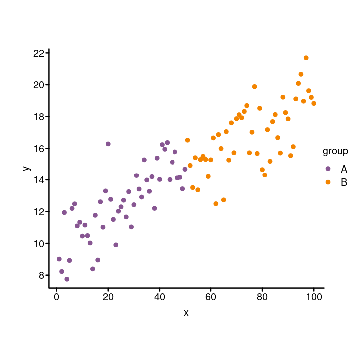
Some final touchups
We’re almost there now! Just a few more adjustments to make: tick label size, plot element colors, and plot margins.
Tick label size
Right now, the tick labels are a lot bigger than they are in the
ggplot version. To fix it, we can pass in cex.axis = 0.85 to the
par function. That way, it will be applied to both the x and y axes
and we don’t have to specify it twice. Remember that the normal cex
is 1 so any number less than that will be smaller than the default.
Plot element colors
Setting the plot element colors can be a little tricky because we have
to specify them in a few different places. I should mention that
there are quite a few ways to control the colors in plots made with
base R graphics. It can get a little confusing as to what parameter
is controlling what aspect of the plot, especially when you consider
that the options passed in to the par function control lots of
different plot elements. For example, par(fg = "green") will turn a
lot of plot elements green, but not all of them. Rather than do that,
we will adjust colors mostly inside the functions that they will
affect.
We will first set a variable to hold the color and use that:
base_color <- "#444444". The axes label colors are controlled with
the col.lab parameter to the par function (col.lab =
base_color). To change the axis (box) line color, we pass in col =
base_color to the box function. For the axes ticks and tick
labels, we the col and col.axis parameters to the axis function
to control the tick color and the tick label color, respectively
(e.g., col = base_color, col.axis = base_color). To change the
legend color, we pass text.col = base_color directly to the legend
function.
Plot margins
As with many other things in base R graphics, there are a couple ways
to control the plot margins. We are going to be using the mar
parameter to the par function. To do so, you pass in a 4 part
vector specifying the size of the margin (in lines of text) of the
bottom, left, top, and right sides of the plot, in that order. The
default is c(5, 4, 4, 2) + 0.1. We will shrink all the margins
except for the right, which we need to increase to make enough room
for our legend: mar = c(3, 3, 1, 3.5). Just to make it clear, that
is three lines of text for the bottom and left margins, one line of
text for the top margin, and 3.5 lines of text for the right margin.
All the final adjustments
Let’s put all the final touchups in now.
base_color <- "#444444"
par(mgp = c(1.5, 0.4, 0), tcl = -0.25,
## Shrink the tick labels.
cex.axis = 0.85,
## Set the axis label color
col.lab = base_color,
## Adjust the margin: bottom, left, top, right
mar = c(3, 3, 1, 3.5))
colors <- c(A = k_purple, B = k_orange)
plot(x, y, bty = "n", xaxt = "n", yaxt = "n",
pch = 20, cex = 1.4, col = colors[group])
box("plot", bty = "l", lwd = 2,
## Set the box color.
col = base_color)
axis(side = 1, lwd = 0, lwd.ticks = 2, mgp = c(1.5, 0.2, 0),
## Set the axis tick and tick label colors.
col = base_color, col.axis = base_color)
axis(side = 2, lwd = 0, lwd.ticks = 2, las = 2,
## Set the axis tick and tick label colors.
col = base_color, col.axis = base_color)
legend(x = "right", legend = c("A", "B"), col = colors, pch = 20,
title = "group", bty = "n", pt.cex = 1.4,
x.intersp = 1.4, y.intersp = 1.15,
inset = -0.1, xpd = TRUE,
## Set the legend text color.
text.col = base_color)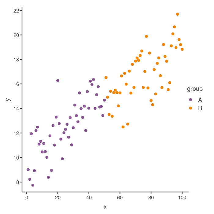
Looking good! So that’s almost the same as the original “classic” theme ggplot2 plot. One thing you may notice is that there are a different number of tick marks on the axes. You can actually adjust this in base R graphics, but it can be a little bit tricky, so we will leave that for another post.
Wrap up
Whew, that was a lot of stuff! As we saw, copying the style of the
ggplot theme_classic requires quite a lot of fiddling around with a
lot of different parameters to a few different functions. If I was
making a plot for a publication or blog post or something, I would
definitely just use ggplot, but it can be fun and educational to try
to reproduce something that an awesome library does with base R
graphics. Hopefully, you enjoyed the process and learned a lot about
base R graphics!
If you enjoyed this post, consider sharing it on Twitter or LinkedIn and subscribing to the RSS feed! If you have questions or comments, you can find me on LinkedIn or send me an email directly.
← Go back