Rotating axis labels in R plots
| Updated:

Hi! I'm Ryan Moore, PhD bioinformatics data scientist, functional programming fan, and sports nerd. Contact me on LinkedIn!
If you want to learn more about styling plots with base R graphics, check out my step-by-step guide to matching the ggplot2 classic theme using base R.
Sometimes you have a plot with axis labels that are too long and end up getting clipped or dropped from the figure. Maybe something like this:
## Set the random seed so your data will be the same as mine.
set.seed(1234)

dat <- list("Cool dataset one"   = rnorm(100, 0),
            "Cool dataset two"   = rnorm(100, 4),
            "Another long name"  = rnorm(100, 5),
            "Really really long" = rnorm(100, 4))

boxplot(dat)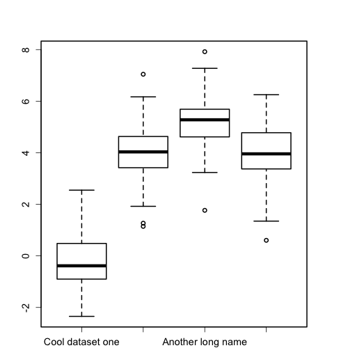
Note: If you’re following along and want your charts to look like mine, you will need run the following par function before generating your plots. It adjusts the margins, the line thickness and the default axis label size.
par(mar = c(6.1, 4.1, 4.1, 4.1), # change the margins
    lwd = 2, # increase the line thickness
    cex.axis = 1.2 # increase default axis label size
    )
The second and fourth x-axis labels are missing because they are too long for R to draw on the plot. Also, the y-axis labels are drawn parallel to the axis, but I think they are easier to read if drawn perpendicular to the axis.
We can fix both problems by rotating the axis labels. Sadly, this is a pretty tricky to do using the base plotting system in R. You need to remove the original axis, add back in new axes and tick marks, add back in the labels, and finally, play around with the positioning of everything until you get it looking good again. So let’s work through it step by step!
Note: This post is goes in to a lot of details and explanations. If you just want to skip to the final result and code, click here.
Remove the original axes
Because the plot function doesn’t provide a way to rotate axis labels, we need to remove the entire axis and redraw it ourselves. We can tell plotting functions like plot and boxplot to suppress axes by passing in xaxt = "n" to turn off the x-axis and yaxt = "n" to turn off the y-axis.
boxplot(dat, xaxt = "n", yaxt = "n")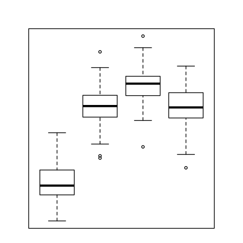
Add the new axes
Now we need to add the axes back in. To do this, we can use the axis function. axis has a lot of different parameters, but the only ones that we need to worry about are side, labels, las, and mgp.
The side parameter
The side parameter takes an integer that specifies the side of the chart on which to draw the axis: 1 for below, 2 for left, 3 for above, and 4 for right. To draw the x-axis then, we would need to pass in side = 1, and to draw the y-axis, we should pass in side = 2.
The labels parameter
The axis function can add labels along with the axis and tick marks, but it will only let you adjust the labels to either be parallel or perpendicular to the axis. While this will be fine for the y-axis, it won’t work for the x-axis since we want to rotate the labels somewhere between 0 and 90 degrees. So for the x-axis, we tell the axis function not to draw labels using labels = FALSE. Nothing needs to be done with this parameter for the y-axis as we want the default y-axis labels to be drawn.
The las and mgp parameters
Because we are letting the axis function draw both the axis and the labels for the y-axis, we will need a couple of more parameters to make it look nice: las and mgp.
The las parameter takes integers in the set {0,1,2,3}. The two we care about here are 0, which specifies axis labels should always be parallel to the axis (the default argument), and 2, which causes labels to always be drawn perpendicular to the axis. To make the y-axis labels easier to read, we want them to be perpendicular to the axis, so we will pass las = 2 to the axis function.
The mgp parameter is a little trickier and not strictly necessary, but we need it to make things look nice. mgp takes a three number vector and is used to adjust the placement of the axis title (mgp[1]), the axis labels (mgp[2]), and the axis line (mgp[3]). If you increase the values, the element will move farther from the plot, whereas decreasing the values moves the elements closer to the plot.
The figure below shows how changing the argument passed to the mgp parameter changes the location of the y-axis and labels.
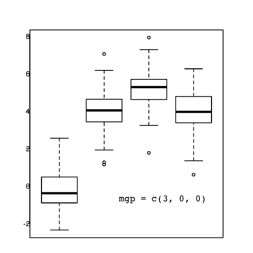
Note: the mgp and las parameters can also be specified in the par function.
Code for the axes
Now that we have explained all the options we need for the axis function, here is the code to add the x and y axes to the chart.
boxplot(dat, xaxt = "n", yaxt = "n")

## Draw the x-axis with no labels.
axis(side = 1, labels = FALSE)

## Draw the y-axis.
axis(side = 2,
     ## Rotate the labels.
     las = 2,
     ## Adjust the label position.
     mgp = c(3, 0.75, 0))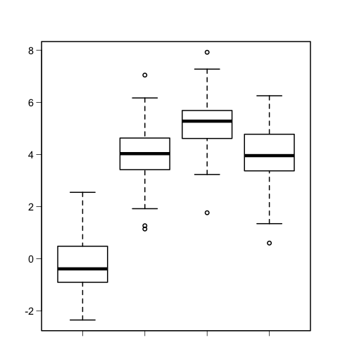
Looking good so far! We’ve got the x-axis back on and we rotated and adjusted the spacing of the y-axis labels so they are easier to read.
Adding the x-axis labels
Here is where things get just a bit tricky. To add text to a chart, we use the text function, but to make it look nice, we need to play around with a few different parameters.
Label text
This is the easy part. Since our data is in a list, we can use the names function to get the name of each series of data.
> names(dat)
[1] "Cool dataset one"   "Cool dataset two"   "Another long name"
[4] "Really really long"
To tell the text function about our labels, we use the labels parameter (the same one we used for the axis function) like this: labels = names(dat).
Label positions
Now, we need to position the labels with the x and y arguments of the text function. These represent numeric vectors of coordinates where the labels will be drawn.
For boxplots, the x coordinates start at 1 and run to the length of the data (in this case 4). So the x argument will be x = 1:length(dat).
On our chart, the y coordinates run from about -2 to 8. Rather than manually trying to figure out what the y coordinates for the axis should be, we can get the coordinates of the plotting region directly with the par function.
The par function is used to set and query graphical parameters. There are a TON of possible arguments so I encourage you to take a look at the documentation by typing ?par or help("par") at the R command line.
To get the coordinates for the edges of the plotting region, we need the usr argument. par("usr") will return a vector of the form c(x1, x2, y1, y2) where x1 and x2 are the coordinates of the far left and far right of the plot (the x range), and y1 and y2 are the coordinates of the bottom and top of the plot (the y range).
Here is the output of par("usr") for our plot:
> par("usr")
[1]  0.340000  4.660000 -2.756291  8.329734
Since we want to draw the x-axis labels at the bottom of the chart, we will use par("usr")[3] as a starting point for the y values.
Let’s see how that looks.
boxplot(dat, xaxt = "n", yaxt = "n")

axis(side = 1, labels = FALSE)
axis(side = 2, las = 2, mgp = c(3, 0.75, 0))

## Draw the x-axis labels.
text(x = 1:length(dat),
     ## Draw labels at the bottom of the chart.
     y = par("usr")[3],
     ## Use the names from the list.
     labels = names(dat),
     ## Increase the label size a bit.
     cex = 1.2)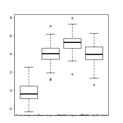
That’s not quite what we want! The labels are more or less in the right spot, but the bottom half is cut off. We can fix that setting the xpd argument to NA, which will let us draw text below the main plot by changing the way plotting is clipped (see the help page for par for more info on how xpd works).
boxplot(dat, xaxt = "n", yaxt = "n")

axis(side = 1, labels = FALSE)
axis(side = 2, las = 2, mgp = c(3, 0.75, 0))

text(x = 1:length(dat),
     y = par("usr")[3],
     labels = names(dat),
     ## Change the clipping region to fix label drawing.
     xpd = NA,
     cex = 1.2)
Alright, the labels are not being clipped any more, so let’s push them down a bit. To do that, we need to subtract a small amount from the y values. Something like par("usr")[3] - 0.45. Check it out:
boxplot(dat, xaxt = "n", yaxt = "n")

axis(side = 1, labels = FALSE)
axis(side = 2, las = 2, mgp = c(3, 0.75, 0))

text(x = 1:length(dat),
     ## Move the labels down by 0.45.
     y = par("usr")[3] - 0.45,
     labels = names(dat),
     xpd = NA,
     cex = 1.2)
Note: Depending on how your chart looks, you will have to change the amount that you subtract from par("usr")[3]. Just play around with it until it looks nice.
Label rotation
Now that the positions of the labels are about right, let’s rotate them! For that we will use the srt argument to the text function. With srt, we can specify the text rotation in degrees, so srt = 35 would rotate the axis labels by 35 degrees.
boxplot(dat, xaxt = "n", yaxt = "n")

axis(side = 1, labels = FALSE)
axis(side = 2, las = 2, mgp = c(3, 0.75, 0))

text(x = 1:length(dat),
     y = par("usr")[3] - 0.45,
     labels = names(dat),
     xpd = NA,
     ## Rotate the labels by 35 degrees.
     srt = 35,
     cex = 1.2)
Label adjustment
Almost done now! The last thing we want to do is to slide the labels down so that the end of the label rather than the center of the label is positioned near the bottom of the tick mark. For that we will use the adj parameter.
According the docs for the text function, the adj parameter takes one or two values that specify the x and the y (if the second value is given) adjustment of the labels. That’s not too specific, but more info is given in the help file for par. Let’s take a look at it:
The value of ‘adj’ determines the way in which text strings are justified in ‘text’, ‘mtext’ and ‘title’. A value of ‘0’ produces left-justified text, ‘0.5’ (the default) centered text and ‘1’ right-justified text. (Any value in [0, 1] is allowed, and on most devices values outside that interval will also work.)
Okay, so adj is used to adjust the text justification: 0 means left-justified, 0.5 is centered, and 1 is right-justified. Values in between are also allowed, so adj = 0.25 would justify the text halfway between left-justified and centered. Confusing? Check out this gif to see how the adj argument affects the labels.
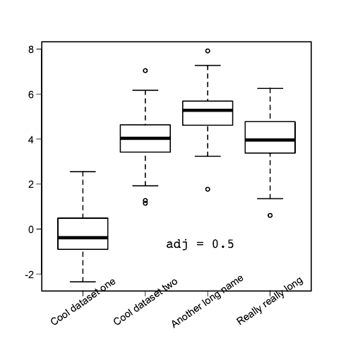
So when adj = 0.5 the labels are centered on the tick mark. When adj = 0, the labels start at the tick mark (left-justified), whereas when adj = 1, the labels end at the tick mark (right-justified).
One thing to note is that the justification is parallel to the reading direction of the labels. That means that if you change the srt angle, the justification of the labels still slides along that angle. Here is an illustration of that:
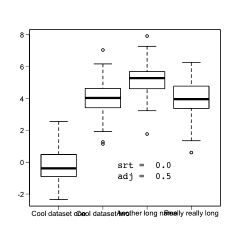
As you can see changing the adj argument will slide the labels along the srt angle.
Putting it all together
We finally got through all the options, so let’s put it together and make our chart!
## Set the random seed to match your data to mine.
set.seed(1234)

## Make some test data.
dat <- list("Cool dataset one"   = rnorm(100, 0),
            "Cool dataset two"   = rnorm(100, 4),
            "Another long name"  = rnorm(100, 5),
            "Really really long" = rnorm(100, 4))

## Adjust some graphical parameters.
par(mar = c(6.1, 4.1, 4.1, 4.1), # change the margins
    lwd = 2, # increase the line thickness
    cex.axis = 1.2 # increase default axis label size
    )

## Draw boxplot with no axes.
boxplot(dat, xaxt = "n", yaxt = "n")

## Draw x-axis without labels.
axis(side = 1, labels = FALSE)

## Draw y-axis.
axis(side = 2,
     ## Rotate labels perpendicular to y-axis.
     las = 2,
     ## Adjust y-axis label positions.
     mgp = c(3, 0.75, 0))

## Draw the x-axis labels.
text(x = 1:length(dat),
     ## Move labels to just below bottom of chart.
     y = par("usr")[3] - 0.45,
     ## Use names from the data list.
     labels = names(dat),
     ## Change the clipping region.
     xpd = NA,
     ## Rotate the labels by 35 degrees.
     srt = 35,
     ## Adjust the labels to almost 100% right-justified.
     adj = 0.965,
     ## Increase label size.
     cex = 1.2)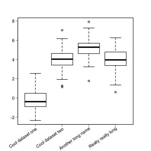
To summarize, if you want to add rotation to axis labels in base R plots, you need to
- Remove the original axis
- Add the axis back in
- Add the labels back in
- Adjust positioning and rotation
That’s it! If you are interested, you can find all the R code and bash scripts used to generate the figures and gifs on GitHub.
If you want to learn more about making beautiful plots with base R graphics, check out my step-by-step guide to matching ggplot2 classic theme in base R.