Making charts with ClojureScript, Reagent, and React-vis

Hi! I'm Ryan Moore, PhD bioinformatics data scientist, functional programming fan, and sports nerd. Contact me on LinkedIn!
React-vis is a visualization library for React made by Uber. It’s pretty sweet and you can make some nice looking charts without too much custom styling. I haven’t really used React-vis too much before, but I wanted to check it out because I have a little ClojureScript/Reagent project that needed some charts. I have used D3 before and I use ggplot pretty much every day for work, so I kind of (unfairly) compare all charting/data viz libraries to those. With that in mind, I like React-vis! The documentation is pretty good, especially when you get it straight from the GitHub page, and I think that it plays much more nicely with Reagent than D3 does. In fact, I’m probably going to reach for React-vis from now on when I need to make some nice looking charts in a Reagent project.
There are quite a few tutorials on using React-Vis for making charts when you’re actually programming in JavaScript/React (see here, here, and this series), but not nearly as many if you want to use React-vis with ClojureScript (here is one). So let’s take a detailed look at how to get started with React-vis and ClojureScript!
Contents
A super brief Reagent intro
Note: I’m assuming that you have some previous experience with ClojureScript and Reagent. If you need more background than this quick refresher, check out this awesome introduction to Reagent.
Reagent is an interface between ClojureScript and React. It lets you define React components using regular old ClojureScript functions and data, and describe the user-interface with a syntax that looks a lot like Hiccup.
For example, you can code a basic Reagent component like this:
(defn little-component [name]
  [:div
   [:p
    "Hi " name ".  I'm the "
    [:span {:style {:color "#888"}} "little"]
    " component!"]])
Just like any other ClojureScript function, you can give it parameters and pass in Clojure data types. Also, now that we’ve defined little-component, we can use it in another component like so:
(defn parent-component []
  [:div
   [:p "I'm the parent component."]
   [little-component "Ryan"]])
As you can see, I passed in the string "Ryan" to the child component. Rendering the parent component would look something like this:

The last thing that you definitely need to know about is the render function, which is basically the entry-point for your Reagent app. It takes two arguments, a component to render, and a DOM node specifying where to render it. Let’s say that our whole app is just the parent-component, and we want to render it to an HTML div with the ID "app". Here is how we would do it:
(defn render-app []
  (reagent.core/render [parsent-component]
                       (.getElementById js/document "app")))
There is a lot more to Reagant, but for our little line chart, that’s all you need to get started.
Setting up the project
First, you will need to have ClojureScript installed on your computer. Check out this quick start guide for more details about getting it set up. Basically, you will need to have a working Clojure install (and a couple other things if you’re on Windows), and that’s pretty much it installation wise.
Next, you will want to set up a project directory so that we can start playing around with some code. To help with this, I’ve made a little Ruby script that will generate ClojureScript project skeletons. If you don’t want to run the Ruby program, I also uploaded the base project to GitHub, so you can download that to get started. Alternatively, if you’re familiar with Clojure/ClojureScript and you like Leiningen, there is a Leiningen template for Reagent applications available here.
If you use the blank project that I have on GitHub, you should have a fully working ClojureScript project. Here is what the directory structure looks like:
$ tree
.
├── bin
│   └── compile_it
├── core.cljs.edn
├── deps.edn
├── figwheel-main.edn
├── resources
│   └── public
│       ├── css
│       │   └── style.css
│       └── index.html
├── src
│   └── cljs_reagent_proj
│       └── core.cljs
├── target
└── test
    └── cljs_reagent_proj
        └── core_test.cljs
To test it out, go ahead and run the script to compile and serve the project.
$ ./bin/compile_itAfter about a minute or so, if everything has gone well, a new browser window should automatically open to http://localhost:9500, and you should see a basic start page that looks something like this one.
If you are not using my project template, you can compile your code with the following command:
$ clojure -m figwheel.main --build core --replReact-vis and other dependencies
Even though React-vis is a JavaScript package, using it in our project won’t be a problem as it is available on CLJSJS. CLJSJS has a ton of common JavaScript packages ready for use in ClojureScript projects. Since we’re using Clojure CLI and the deps.edn file to manage dependencies, we need the ClojureCLI/deps.edn listing on the Clojars React-vis page:
cljsjs/react-vis {:mvn/version "1.11.1-0"}Now we can add that line to the project’s deps.edn file like so
{:deps {com.bhauman/figwheel-main {:mvn/version "0.2.0"}
        com.bhauman/rebel-readline-cljs {:mvn/version "0.1.4"}
        reagent {:mvn/version "0.8.1"}
        cljsjs/react-vis {:mvn/version "1.11.1-0"}}
 :paths ["src" "test" "target" "resources"]}
You will notice that this file also has a couple of other dependencies listed. One is for Reagent, and the other two are needed for Figwheel, which builds our ClojureScript code and hot loads it. It’s pretty cool, and I encourage you to check out the Figwheel tutorial to learn more about it.
Making a basic chart
Now that we have all of the dependencies ready to go, let’s start plotting some data!
Require the React-vis namespace
Go ahead and open up the file that holds most of the important ClojureScript code, src/cljs_reagent_proj/core.cljs. You should see some boilerplate code already included. Currently, the ns function look something like this
(ns cljs_reagent_proj.core
  (:require
   [reagent.core :as r]))
As you can see, we are already requiring the reagent.core namespace and giving it the alias r. This will let us type Reagent functions like this, r/atom, rather than like this, reagent.core/atom. Now, to use the react-vis library, we need to add [cljsjs.react-vis :as rvis] to the namespace function like this
(ns cljs_reagent_proj.core
  (:require
   [reagent.core :as r]
   [cljsjs.react-vis :as rvis]))
Again, the :as lets us refer to the React-vis components as, rvis/XYPlot and rvis/LineSeries rather than typing the whole thing out.
Generate some data
Well, now we need some data to plot! Let’s start with something simple. All we need is a vector of maps, each specifying the X and Y coordinates of the points that we want to plot.
(def chart-data [{:x 1 :y 1}
                 {:x 2 :y 2}
                 {:x 3 :y 4}
                 {:x 4 :y 5}
                 {:x 5 :y 4}
                 {:x 6 :y 6}
                 {:x 7 :y 8}
                 {:x 8 :y 6}
                 {:x 9 :y 5}
                 {:x 10 :y 5}])
Now that we have some data, let’s plot it!
Set up the app scaffold
In the very brief intro to Reagent, I mentioned that the render function is used to actually display our app. In this case, our app will just be a chart, so we will go ahead and set up a scaffold component to hold all the subcomponents of the chart, and then pass that scaffold to the render function. Let’s see how that works.
;; Just a placeholder!
(defn line-chart [data]
  [:div])

(defn app-scaffold []
  [:div
   [line-chart chart-data]])

(defn render-app []
  (r/render [app-scaffold]
            (.getElementById js/document "app")))

(render-app)
The first function defines the app-scaffold component. It specifies a div that holds a line-chart component, to which we’re passing the chart-data we set up earlier. Of course, we haven’t defined the line-chart component yet, but we will get there shortly! The second function is the one which calls render. We pass it the app-scaffold component and the DOM node as selected by the (.getElementById js/document html-id-app) bit. The last line is simply calling the render-app function so that it actually gets rendered.
Now that we have the data and the app-scaffold, let’s put together the line-chart component!
(Note: If you’re coding along with me, at this point your src/cljs_reagent_proj/core.cljs file should pretty much match the code in this GitHub Gist. Each time I show a new screenshot of the chart, I will include the current snapshot of the core.cljs code as well.)
The XYPlot component
The first thing you need to know is that every React-vis chart lives in a base component called XYPlot. All of the elements that we add to the plot will be children of the XYPlot component. (I like this feature. It reminds me of the Grammar of Graphics and using ggplot for making graphics in R.)
On the React-vis tutorial page, you will see a basic XYPlot component specified something like this:
<XYPlot width={800} height = {225} />Remember that React-vis is a library for making graphics with React, so we need a way to make a Reagent component from the React component XYPlot. To do this, we pass it to reagent/adapt-react-class, the function that takes React components and returns something that we can use like any other Reagent function. So instead of saying [rvis/XYPlot ...] directly, we have to say [(r/adapt-react-class rvis/XYPlot)]. XYPlot needs width and height properties as well. To specify these, we pass in a regular old ClojureScript map with keys :width and :height. Putting it together, we get
[(r/adapt-react-class rvis/XYPlot)
   {:width 800 :height 225}]
Wrapping up the React component in a call to r/adapt-react-class everytime we want to use it in the first position of Reagent Hiccup form will get annoying quick. Luckily, Reagent has shorthand for this: :>. Using the shorthand, we can write the component like this instead:
[:> rvis/XYPlot
   {:width 800 :height 225}]
The LineSeries component
In React-vis, the way to visualize your data is with Series components. There are a lot to choose from, but for our data, I think a line chart would be best. To add a line chart to our figure, we will need to add a LineSeries component. Let’s do that now!
All of the *Series components require a data property. When using React-vis with JavaScript, you would pass an array of objects to the data property, but we will be passing in a vector of maps instead. Recall that in the app-scaffold component, we call the line chart component like this: [line-chart chart-data]. This means that we’re passing in the chart-data that we made earlier to the line-chart component. That’s fine because we define Reagent components just like plain old ClojureScript functions, meaning that we can pass Clojure data types right in. With that in mind, let’s redefine the line-chart component like this:
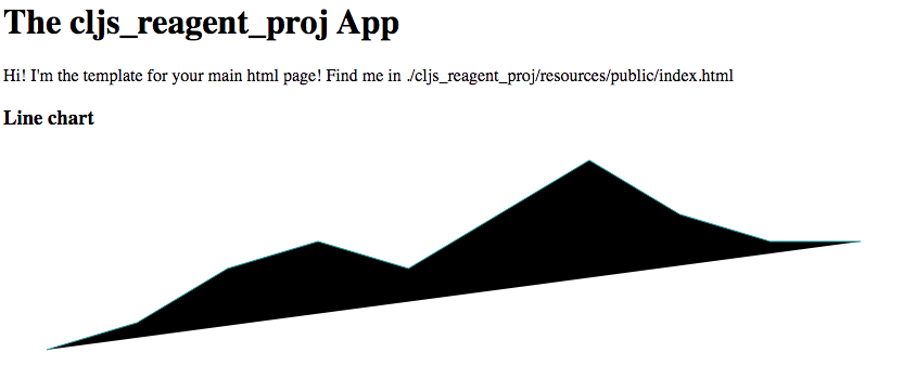
(defn line-chart [data]
  [:> rvis/XYPlot
   {:width 800 :height 225}
   [:> rvis/LineSeries {:data data}]])
If you look at the chart now ((open http://localhost:9500/), it’s pretty ugly! We need to add a bit of CSS style to get rid of the fill.
(Here is the 2nd code snapshot.)
Styling components
We can add style directly to our components using the style property. If you look at that page, you will see an example like this
<LineSeries
  data={data}
  style={{strokeWidth: 2}}
/>
You can see that the style property of the LineSeries component takes a JavaScript object. The keys are CSS properties and the object’s values are the values that you want for the CSS properties. Note that you have to camel case the CSS properties (so instead of stroke-width, you have to write strokeWidth).
Now to make this work in Reagent, we add a :style key to the LineSeries component’s property map. The value for this new key will be a map specifying all the CSS properties that we want to use. Something like this: :style {:cssProperty "newValue"}. Since we are trying to get rid of that wonky fill, the CSS we want is fill: none. Here is how we code that into our LineSeries component.
[:> rvis/LineSeries
    {:data data
     :style {:fill "none"}}]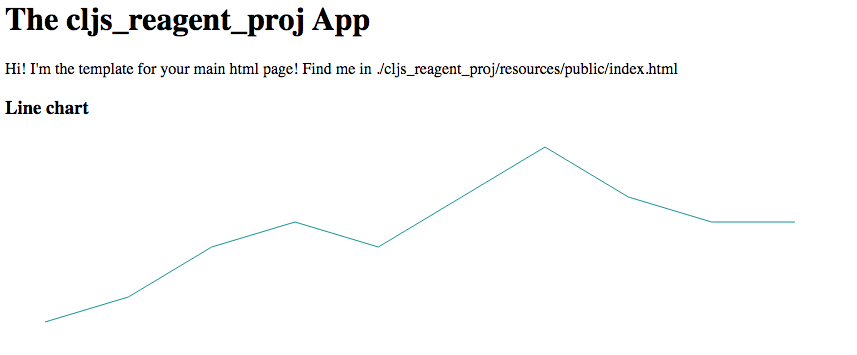
That’s looking better! Next, we should add some axes.
(Checkout the 3rd code snapshot.)
The Axis components
Again, all plot elements in React-vis are specified by adding child components to XYPlot. One thing to keep in mind is that the order of the components matters. The components listed first are drawn before components listed last. For this chart, it really doesn’t make a difference as there are no overlapping chart elements, but depending on your chart, you may need to play around with the drawing order to get the effect you’re looking for.
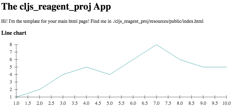
In React-vis, the compenents for adding axes are XAxis and YAxis. The axis components don’t require any properties, so we can add them straight in:
(defn line-chart [data]
  [:> rvis/XYPlot
   {:width 800 :height 225}
   [:> rvis/XAxis]
   [:> rvis/YAxis]
   [:> rvis/LineSeries
    {:data data
     :style {:fill "none"}}]])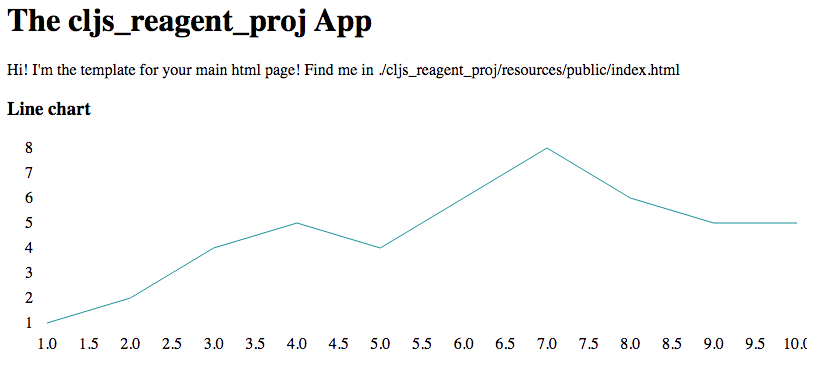
Not bad. We’ve got some numbers on there, but still no axis line, and if you look closely, you will see that the last X axis label, 10.0, is slightly cut off. Let’s fix both of these issues.
(Here’s snapshot number four.)
Fixing the axes
First, let’s add in the axis lines. Like other React-vis components, the Axis components also take a style property. In this case, it is more complicated than the style we added to the LineSeries component. Axis components add a lot more elements to the plot, and each one of these can be controlled by the style property. Let’s see how it works.
{:style {:line {:stroke "#333"}
         :ticks {:stroke "#999"}
         :text {:stroke "none"
                :fill "#333"}}}
As you can see, the style property has more going on than before. The value for the :style key is now a map. The keys are the elements that we want to style, and the values are themselves maps with CSS property-value pairs. In this way, we can send specific styling instructions to each of the subcomponents. Since both axes are going to have the same basic style, let’s bind that map to a variable with def and then use that instead. Something like this:
(def axis-style {:line {:stroke "#333"}
                 :ticks {:stroke "#999"}
                 :text {:stroke "none"
                        :fill "#333"}})

(defn line-chart [data]
  [:> rvis/XYPlot
   {:width 800 :height 225}
   [:> rvis/XAxis {:style axis-style}]
   [:> rvis/YAxis {:style axis-style}]
   [:> rvis/LineSeries
    {:data data
     :style {:fill "none"}}]])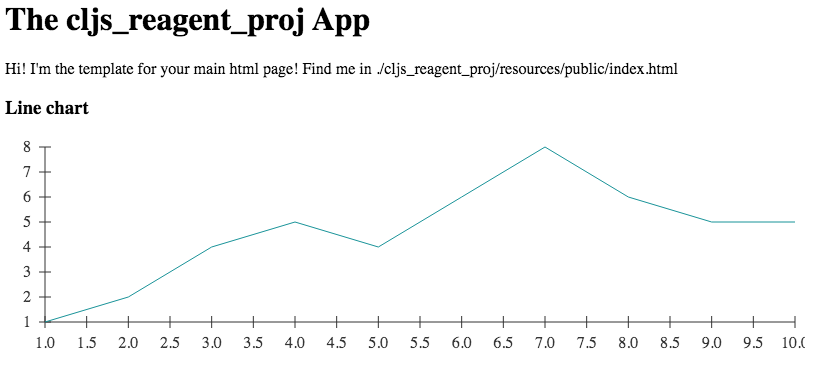
(Here is the fifth code snapshot.)
The second issue we had was with the last X axis label being a bit cut off. While there are probably a lot of ways we could fix this, I’m going to use the margin property of the XYPlot to push the edges of the chart in just a bit.
[:> rvis/XYPlot
   {:width 800
    :height 225
    :margin {:left 50 :right 50}}

   ... more stuff below ...
As you can see, I added a new key :margin with the value {:left 50 :right 50}, which sets the left and right chart margins to 50 pixels each.
Looks pretty good! Now that we have pretty much everything to make a decent looking chart, we are going to spend the rest of this post tweaking the style of the chart to make it look a bit better.
Give it a little more style…
You may be wondering why the line series is a greenish color even though we didn’t add any styling. Well, React-vis includes some styling defaults to help you get a decent looking chart as quickly as possible. (They even have some stylesheets that you can adapt for your own project!) Of course, we can modify this style in the same way as we did before.
There are a couple of ways that we can add style to various chart components. Many chart components have a few explicitly defined style properties. For example, in the case of LineSeries we can use the color property to directly set the color, and the strokeWidth property to directly set the stroke width. Alternatively, we could use the style property again to set all the CSS properties together. The style property is also useful for setting any styles that don’t already have their own properties. Let’s use the dedicated properties to change the line color to a nice orange and the line thickness to 5.
[:> rvis/LineSeries
    {:data data
     :color "#e47320"
     :strokeWidth 5
     :style {:fill "none"}}]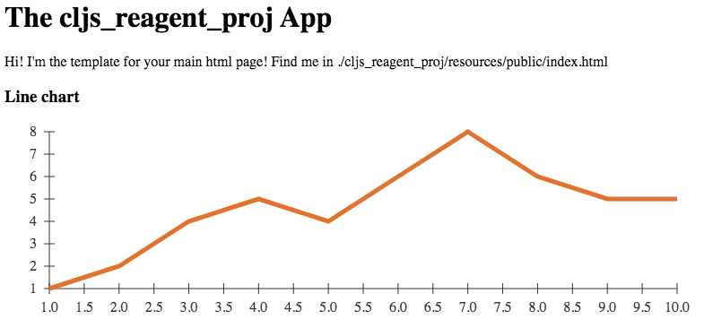
(Here is the snapshot of the code so far.)
Cool! Can you see how when the line changes directions it’s a little bit “jagged”? Well, we can smooth that out a bit with the stroke-linejoin and stroke-linecap CSS properties. We can use these properties in our style map, but remember that we have to convert them to camel casing. Here’s what it looks like:
[:> rvis/LineSeries
    {:data data
     :color "#e47320"
     :strokeWidth 5
     :style {:fill "none"
             :strokeLinejoin "round"
             :strokeLinecap "round"}}]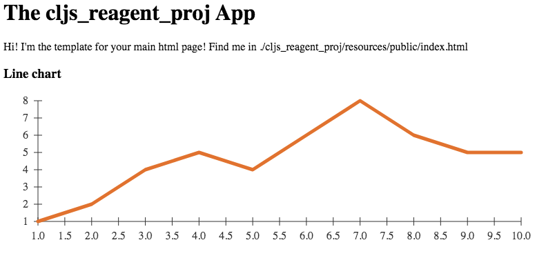
(Another code snapshot)
The difference is subtle, but I think it looks a little cleaner now.
So styling chart elements is mostly a matter of adding CSS properties to the style property map. Again, some chart elements have explicit properties for commonly used properties like color, but you can always just use the style property and CSS tags instead.
Clean up the axes
Right now, I think the axes look a bit messy. The X axis has too many tick marks, and the labels don’t need to be written to the tenths place. We can limit the number of tick labels with the tickTotal property of the XAxis component. As you will see, limiting the number of tick marks will also fix the label precision problem. If we want 10 tick labels we add :tickTotal 10 to the XAxis properties map like this
[:> rvis/XAxis
 {:tickTotal 10 :style axis-style}]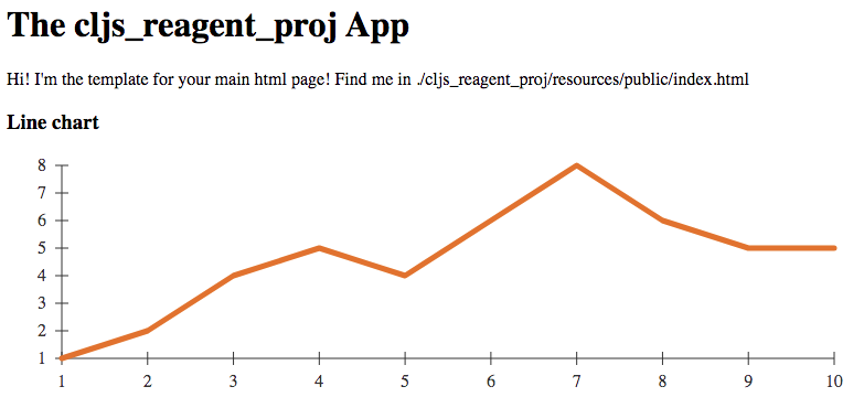
The tick marks look a little long to me, and they stick up in to the actual chart, so let’s clean them up next. The Axis components have dedicated properties for controlling the size of the tick marks: tickSize, tickSizeInner, and tickSizeOuter. The ones we want are tickSizeInner, which controls the size of the tick mark that sticks into the chart and tickSizeOuter, which controls the size of the tick mark that sticks out towards the axis labels. I want the tick marks to be flush with the axis labels, so we will set tickSizeInner to 0. Also, we will set tickSizeOuter to 3, so that they don’t jut out too far towards the labels.
[:> rvis/XAxis
 {:tickTotal 10
  :tickSizeInner 0
  :tickSizeOuter 3
  :style axis-style}]
[:> rvis/YAxis
 {:tickSizeInner 0
  :tickSizeOuter 3
  :style axis-style}]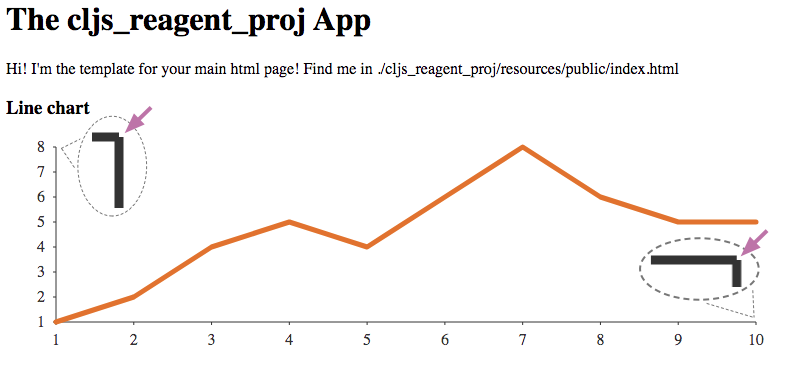
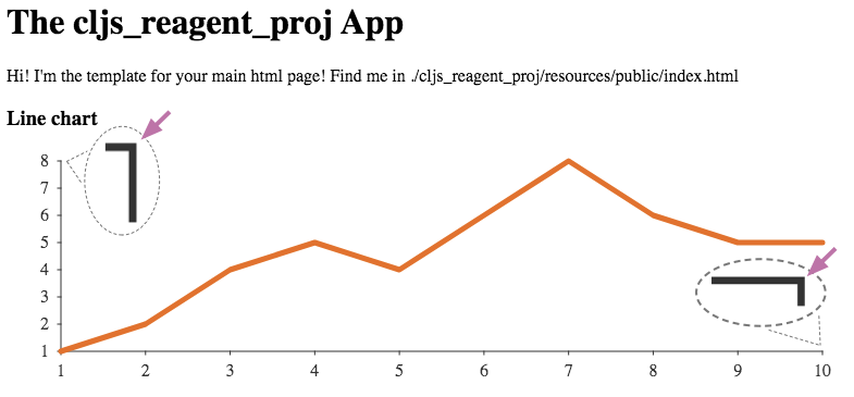
Though it isn’t too apparent when you look at the chart at the normal zoom level, if you look closely, you will notice a tiny gap between the final axis tick mark and the axis line itself. In the image above, I added little zoomed in sections of the ends of the axes so you can more clearly see what problem is.
I think that looks gross, so let’s fix it! To do that, we will use the stroke-linecap attribute again. This can be specified as a CSS property in the style map for the line subcomponent like this
(def axis-style {:line {:stroke "#333"
                        :strokeLinecap "square"}
                 :ticks {:stroke "#999"}
                 :text {:stroke "none"
                        :fill "#333"}})
And it’s fixed!
(The final code listing!)
Putting it all together
Finally, we’ve made a decent looking chart! Though it took a while to get through all the details, making a chart with React-vis is pretty straightforward. You set up your XYPlot parent component, bind your data to a LineSeries component, add in the XAxis and YAxis components and then play around with the styling until you get it looking the way you want.
We’ve only scratched the surface of what you can do with React-vis in this post. There is definitely a lot more that we could talk about, like fancier styling, animation, interaction, and reading chart data from JSON files, but those will have to wait until future posts! For now, let’s wrap this up by taking a look at the final code in our core.cljs file.
(ns cljs_reagent_proj.core
  (:require
   [reagent.core :as r]
   [cljsjs.react-vis :as rvis]))

(def chart-data [{:x 1 :y 1}
                 {:x 2 :y 2}
                 {:x 3 :y 4}
                 {:x 4 :y 5}
                 {:x 5 :y 4}
                 {:x 6 :y 6}
                 {:x 7 :y 8}
                 {:x 8 :y 6}
                 {:x 9 :y 5}
                 {:x 10 :y 5}])

(def axis-style {:line {:stroke "#333"
                        :strokeLinecap "square"}
                 :ticks {:stroke "#999"}
                 :text {:stroke "none"
                        :fill "#333"}})

(defn line-chart [data]
  [:> rvis/XYPlot
   {:width 800
    :height 225
    :margin {:left 50 :right 50}}
   [:> rvis/XAxis
    {:tickTotal 10
     :tickSizeInner 0
     :tickSizeOuter 3
     :style axis-style}]
   [:> rvis/YAxis
    {:tickSizeInner 0
     :tickSizeOuter 3
     :style axis-style}]
   [:> rvis/LineSeries
    {:data data
     :color "#e47320"
     :strokeWidth 5
     :style {:fill "none"
             :strokeLinejoin "round"
             :strokeLinecap "round"}}]])

(defn app-scaffold []
  [:div
   [line-chart chart-data]])

(defn render-app []
  (r/render [app-scaffold]
            (.getElementById js/document "app")))

(render-app)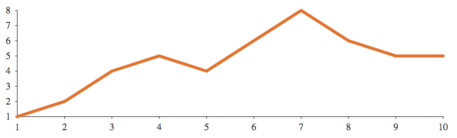
If you want to see the full app code for the charts in this post, as well as the original project skeleton, check out the GitHub repository.
If you enjoyed this post, consider sharing it on Twitter or LinkedIn and subscribing to the RSS feed! If you have questions or comments, you can find me on LinkedIn or send me an email directly.
← Go back